Reimagining The Rio: the process behind a brand

Full disclosure: nobody asked me to do this project – It’s a passion project I created during a course last summer. BUT the cool part about that is: I can share every single detail about the process to show how a brand is made. Enjoy!
The Rio Theater is a historic art deco theater in Overland Park, KS. It happens to be right next door to our family retail store… which is probably how I became so obsessed with it.
The Rio opened on Christmas day in 1946 with a John Wayne film as the headliner. It has been a place for town meetings, a place for locals to unwind on nights and weekends, and its facade lit the sidewalks for almost 75 years. It closed in 2020 during the pandemic and has yet to re-open.
I drive by the Rio at least twice a day. It’s still a beautiful building, and I’m proud it’s part of our town – but I do wish we talked about it more and that there was more urgency around its future.


Digging into the history
Every logo project starts with a “Discovery” phase and research. During discovery, I interview stakeholders to find out their goals and inspiration. Who is the audience? What do you want them to feel? What song would play during your halftime commercial?
I reached out to some friends (who have dreamed out loud many times about owning the Rio), told them about my project, and asked what their plans would be with with theater. They gave me some great insights about who the audience would be in our area, and their ideas for how to revive the theater.
I didn’t realize it until I started researching The Rio more, but our hometown theater is only one of many beautiful art-deco buildings designed by the architectural firm, The Boller Brothers. They were based in Kansas City, but designed nearly 100 classic theaters across the entire United States.
Our hometown theater is only one of many beautiful art-deco buildings designed by the architectural firm known as the Boller Brothers.

The Boller Brothers designed dozens of theaters from California to Boulder to Pennsylvania. These are some of my favorites that I took inspiration from for the Rio brand.

Goals and brand traits
My goal for the re-brand was to create a visual identity that:
respected the art deco / southwestern style of the 1940’s icon
respected the history that the space has played in our community
brought back the ✨ magic of the movies ✨
is dope as hell for the millennial families in my neighborhood
Before sketching logos, I took time to write down what characteristics the new brand should have: nostalgia, hollywood magic, community pride, and unshakeable confidence. These brand traits are used to answer questions like “how does our brand talk?” or “what is important to us?”


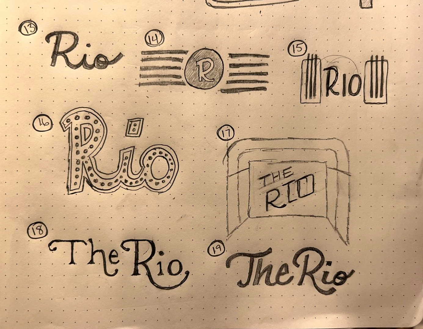
Sketches: Getting ideas on paper
After the research and discovery phase, it’s time to start sketching!
There is a coffee shop across the street from the theater and I spent a few afternoons staring out the window, dreaming about The Rio’s heyday, and coming up with as many ideas as possible.
The goal of the sketching phase is to get as many ideas as possible on paper. They might look rudimentary, but you can get a feel for which ideas are good or bad very early on – even with a basic, messy sketch.
I explored:
Using “The Rio” vs. simply “Rio”
Possible taglines
Different shapes pulled from the building’s architecture
Inspiration from the original marquee, when it was called The Overland Theater
Motifs from other Boller Brothers theaters


Round 1: Exploring different logo options
Once there are plenty of ideas to work with, I like take some time to digest the sketches and show peers to get their thoughts and feedback. Many times, patterns start to emerge quickly and people gravitate toward the same ideas.
For branding clients, we start with 2-3 different logo options. Sometimes these are inspired by the sketches, sometimes they are client ideas, and sometimes a new concept happens (seemingly by accident) during the process.
Then we apply each logo to different scenarios to see how it feels in the real world. What’s it look like on a popcorn bucket? Does it fit on a movie poster? Can you put it on a hat?
What’s it look like on a popcorn bucket? Does it fit on a movie poster? Can you put it on a hat?

Creating different variations of the chosen logo design. Each version has a specific use case: e.g., horizontal logos look best on a website, while icons are better for smaller sizes like a profile picture.
Round 2: re-working the favorite
After reviewing the different logo designs from round 1, I usually encourage clients to choose one “that feels like it’s the closest.” It doesn’t need to be perfect yet, we just need something to build upon.
Sometimes an early version needs very few updates. Sometimes we take two different ideas that resonate and smash them together into a new design.
Sometimes an early version needs very few updates. Sometimes we take two different ideas that resonate and smash them together
This stage is also important for building out the “logo system” – that is the different sizes and versions of the logo that will be used for different scenarios.
The Rio logo is a great example of how feedback can influence the logos throughout the process. In round 1, my chosen logo was just text inside quotation marks to imitate a movie title. A friend recommended adding the horizontal lines to it, which makes it resemble the marquee even more.
Feedback is a gift! The work almost always gets better with each step forward.
A simple comment from friend and mentor, Jen Hood, took the logo to the next level. She said, “What if you added the lines from the marquee???”


Type, Color, & Patterns
Once a logo is chosen, things really start to come to life! We add color, choose fonts that reflect the brand, and create a “visual language” using shapes and patterns.
I chose southwestern-inspired colors to match the peach bricks of the building, and created patterns inspired by the lines and features of the building.
In the slide above, you can really see how adding color can give everything a completely different feeling. It’s softer, a little more romantic. The colors also give you more opportunity to switch things up when applying your brand to real-world scenarios.

Sending it into the Universe
It’s tempting to work on projects like this forever – endlessly making changes and incremental improvements. But at a certain point the work has to get out there.
It’s tempting to work on projects like this forever… But at a certain point the work has to get out there.
For a passion project like this, it might be even more intimidating. You wonder, Will people think I’m lame for wasting so much time on a fake project?
Sharing work that you love is always hard, but there are always more people who respond than I expect. Put your work out there, and your people will find you.
Speaking of “your people will find you”… My buddy, Steven Johnson, was so hyped about this project that he took it a step further and made these sick animations, just for fun.
Maybe someday we’ll actually see them on screen at a movie premier ❤️

Thanks for following along, I hope you enjoyed a look behind the scenes.
You can learn more about my brand work here. And shoot me an email if you have an idea of your own. I’d love to help you bring it to life.